MightyMongoose is a new entertainment-ticketing site that boasts VIP offers for travelers visiting major U.S. cities. The site launched in July 2015 and to date has seen minimal success.
At a 3-hour design jam, I had the pleasure of working with a team of eight other designers to help MightyMongoose become a contender in the entertainment ticketing space.
With time against us, my team and I decided on a roadmap that allowed us to maximize the three hours we were given.
Our only deliverable was to have rough sketches of our ideas and walk through our design process and decisions.
Team Result:
We presented a set of sketches and a paper prototype that showcased the new discovery flow for the MightyMongoose website
Solo Result:
After the event ended, I designed a low fidelity wireframe.
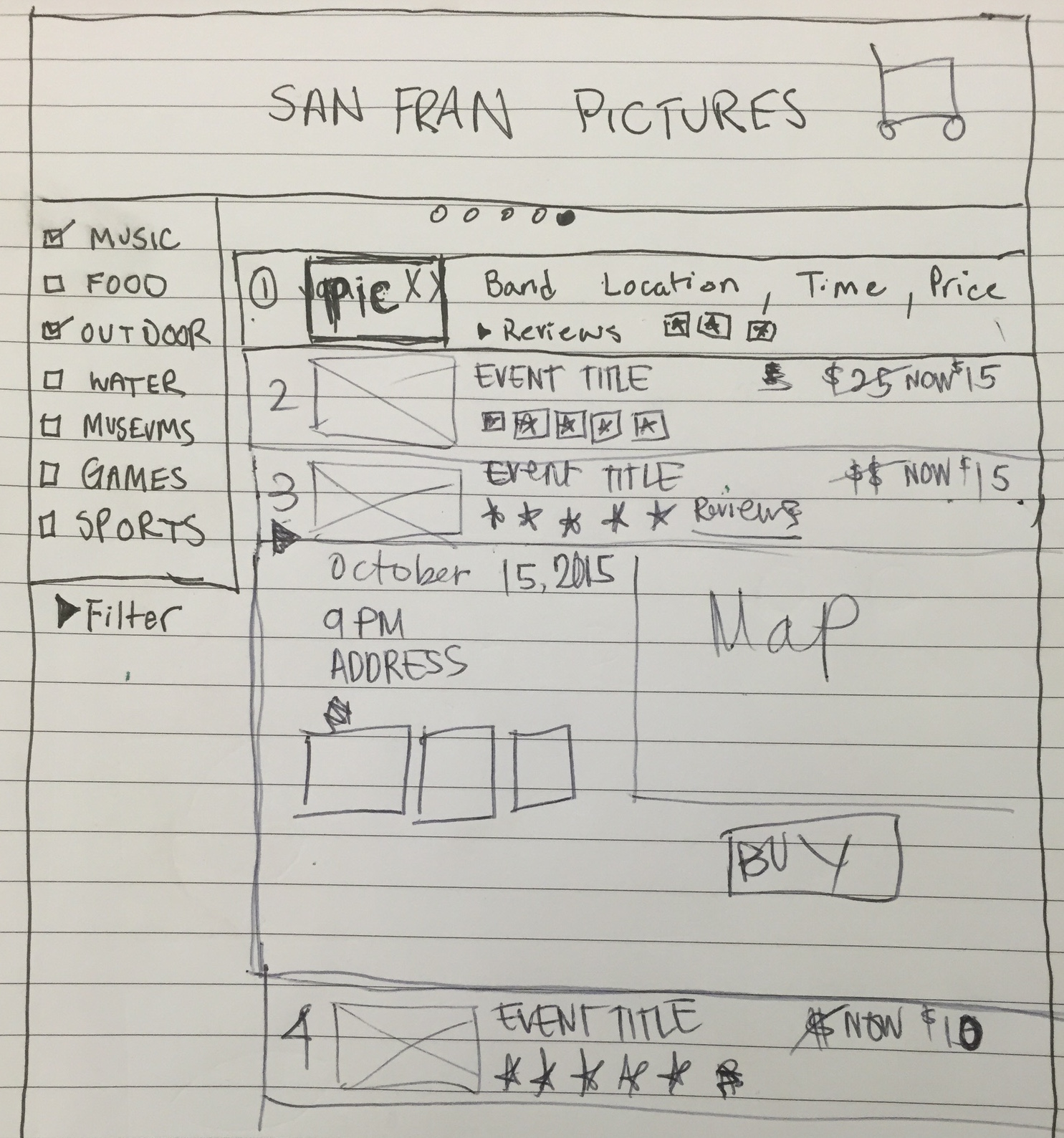
Team result
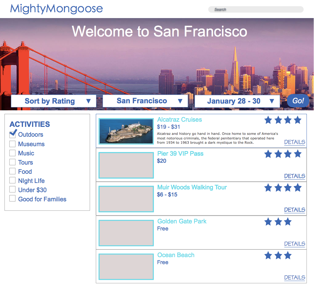
Solo result
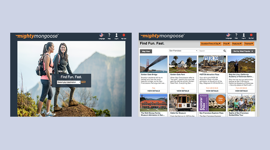
We started the process by reviewing the contents of MightMongoose's site. We paid special attention to possible areas of frustration for users and broken elements of the discovery flow.
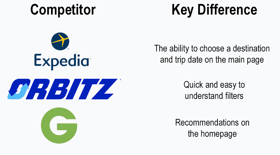
My team and I reviewed three similar entertainment-ticketing sites to understand the discovery flow that they used and how they differed from MightyMongoose's.

Sarah is planning a weekend trip to San Francisco with her girlfriends. Sarah has only visited the city once before on business and wants to visit the top tourist attractions without spending a lot of money.
Behaviors
Goals
The original discovery task flow for MightyMongoose was broken and overwhelming. While other sites allow users to input their destination, dates and even choose from types of attractions before seeing results, MightyMongoose only let's users choose a destination.
Users are then presented with every possible attraction for a given city that they either have to scroll or filter through.
Unfortunately, the filtering function leaves much to be desired. Users have so many filtering options that it quickly becomes overwhelming. The "When?" filter alone has 12 choices.
Lastly, there is WAY too much text.
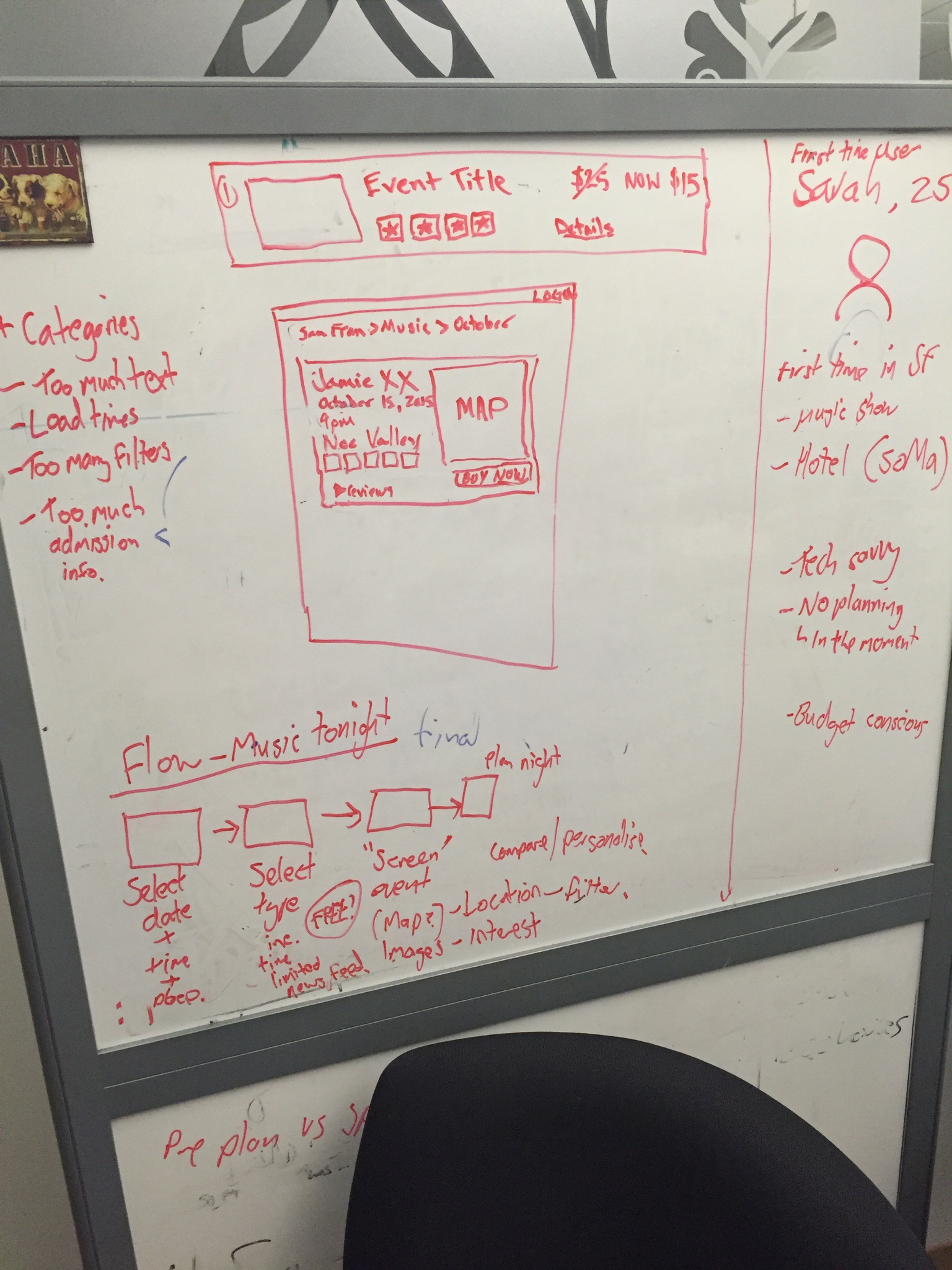
We did a lot of white boarding during this process - this image shows a bit of persona development, usability issues, task analysis and sketching.
My team elected to use a familiar interface for the first screen of the flow. It allows users to choose from simple icons to represent the types of entertainment they want to experience. 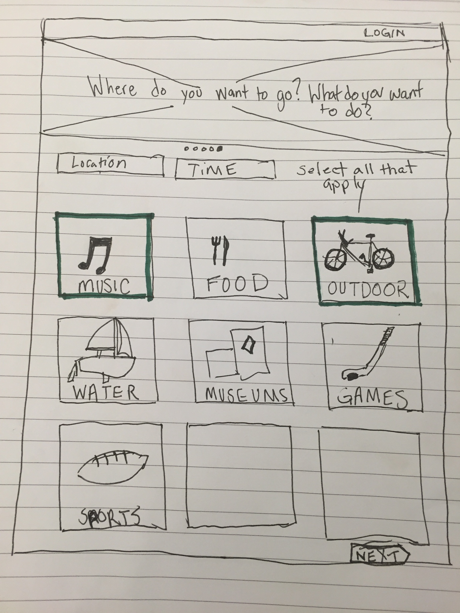
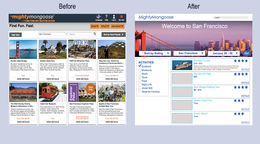
We cleaned up the results page by eliminating the four-column card layout and decided to use a two-column layout instead. 
After the event ended, I worked on a quick low fidelity wireframe to compare the old site to my team's new idea.
Working with a team of eight other designers was a very challenging experience. Not that my team was especially argumentative or hard to work with - we were, howevever, very talkative.
Sometimes it was hard to decide on the "best" option because someone always had another point to share. If we had more time, I do believe we would have been able to establish a better system for productivity.