OpenOakland
UX Research
3 Months (Ongoing), Team Project
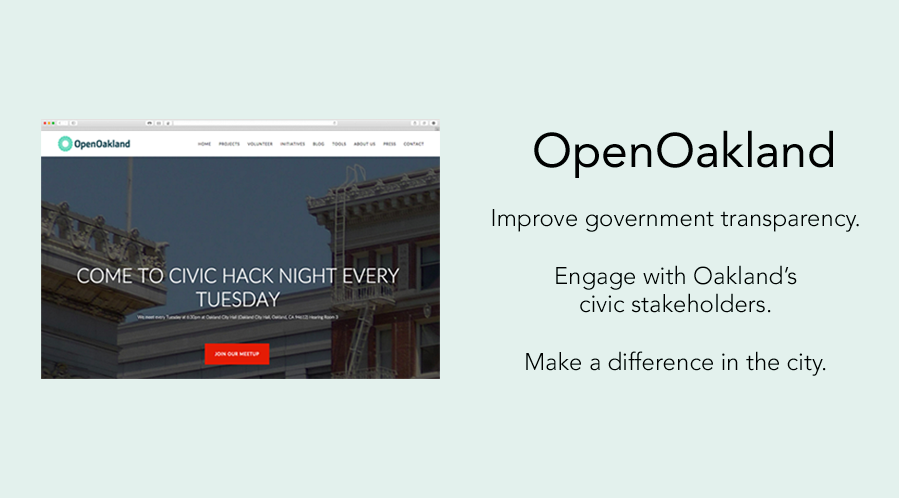
OpenOakland is a three-year-old chapter of Code for America whose goal is to liberate citizens to ideate and develop projects to improve their community.
OpenOakland.org was in need of a redesign so the executive board assembled a team of volunteer designers, developers, content marketers and project managers to launch a new website.
I was brought on to lead the user research arm of the project. Deliverables include:
There are a lot of stakeholders involved with this project: OpenOakland members, Oakland citizens, sponsors and city representatives. With all of the different perspectives, constraints sometimes change abruptly because of stakeholder feedback. Additionally, we are also working against a predetermined timeline.
The design team crafted a process that required each page of the website to be redesigned at least 3 times, with user research occurring between each iteration.
I was tasked with facilitating each research phase and collecting qualitative and quantitative data to help prioritize and inform the team's design decisions.
This project is still ongoing with an estimated end date of January 2016. We are still utilizing our research, iterate and repeat process and planning to launch OpenOakland.org on time.
One of the main functions of my role is to conduct regular user testing of wireframes for the pages of the website. To make this more efficient and to increase the ROI of each session, I developed the following process to collect and compile data from testing:
The goal for each page was to get user frustrations under 40%.
I conducted remote moderated sessions to test each wireframe. Users were tasked with walking through a hi-fidelity wireframe while “thinking out loud.”
The goal was to test the hypotheses I gathered during my usability test and identify other frustrating elements that I didn't initially identify.
During testing, I ranked each frustrating or confusing element on a scale of 0 - 5.
My scale of usability:
0 – Users did not notice or acknowledge this element
1 – Users acknowledged this element and immediately understood it
2 – Users acknowledged this element as “confusing” but quickly figured out its meaning
3 – Users acknowledged this element as “confusing” and took a few minutes to figure out its meaning
4 - Users acknowledged this element as “confusing” but later figured out its meaning after moving on
5 – Users acknowledged this element as “confusing” but never figured out its meaning.
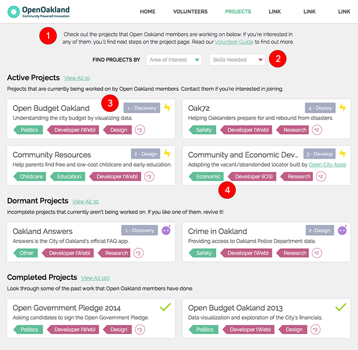
Here is one of the wireframes that I tested:

I organized my hypotheses into this chart:

This is the completed chart after testing was over:

After compiling the data, I determined that this page had a "frustration percentage" of 62%. Based on the data and user feedback, I wrote my recommendations and presented them to the design team.
Below is an annotated wireframe that I presented to the design team along with the corresponding recommendations based on test data and user feedback.
In addition to collecting quantitative data, I used other techniques to collect qualitative. A few techniques I used were:
Right now I'm designing the usability test for the in-person testing of this site. All of the pages have gone through the necessary re-designs and the site is currently in development.