Bateman Group
UX/UI Design
3 Months, Solo Project
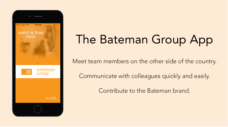
Bateman Group is a technology PR firm based in San Francisco with an East Coast office in New York and remote employees in Oregon and Ohio. With the company expanding at a rapid pace, Bateman Group worked with a software development agency to create an internal smartphone app for its growing company.
A few weeks after launch, Bateman Group found that very few of its employees were using the app.
This project allowed me to use a variety of techniques to gather the most valuable information. Some techniques I used to get to the final product include:
After analyzing the user research, sketching and testing different iterations of the app, I proposed the following solutions:
Full disclosure: Bateman Group decided to pull the plug on the smartphone app before the changes I proposed went to development.
During the content analysis I reviewed current task flows, assessed possible points of user frustration and developed a list of hypotheses that I later tested.
The analysis revealed a number of possible user frustrations including lengthy task flows and a confusing feature hierarchy.

With my hypotheses in mind, I interviewed 6 Bateman Group employees about their work habits and current interactions with the Bateman Group App.
Preliminary user testing helped me understand how users were already interacting with the app. I used this info to support or refute my hypotheses and uncover other sources of frustration or opportunities for experience improvement.
From my testing, I found that users had issues:
After discussions with Bateman Group leadership and Bateman Group employees, I created two personas to better understand who I was designing for.

Oliver is constantly in and out of the office and needs to contact his team members back in the office frequently. Currently, Oliver will email or text co-workers when he is out but hates searching his contacts or emails for phone numbers.
Behaviors
Goals

Nancy is a new Bateman Group employee, based in the San Francisco office. While most of her teams are also in SF, she's had email exchanges with her co-workers in New York. Nancy will hopefully have the chance to meet her New York colleagues in the future, but for now she doesn't have a relationship with any of them.
Behaviors
Goals
I boiled down the needs and goals of Oliver and Nancy into a group of user stories to better design features for them.
Here's one of Dan's stories:
"As a busy PR professional, I want to stay connected to my teams so that I can conduct business seamlessly whether I'm in the office or not."
And one of Nancy's:
"As a new employee, I want to get to know my co-workers so that I can form friendships at work."
Before I started sketching screens, I designed new task flows for making phone calls, sending messages and editing a profile. Below is my proposed task flow for making a phone call.

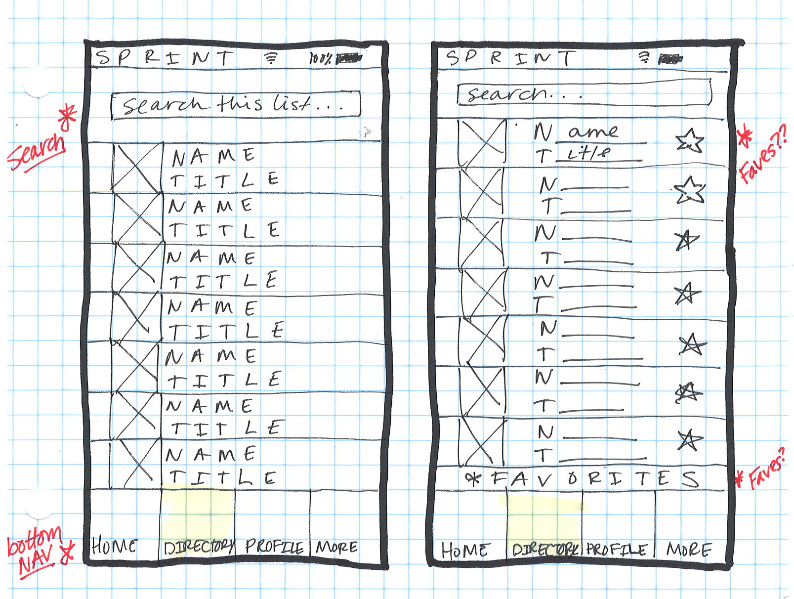
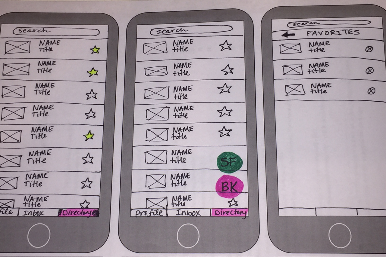
Armed with a pretty solid stack of research, I moved on to sketching and wireframing.
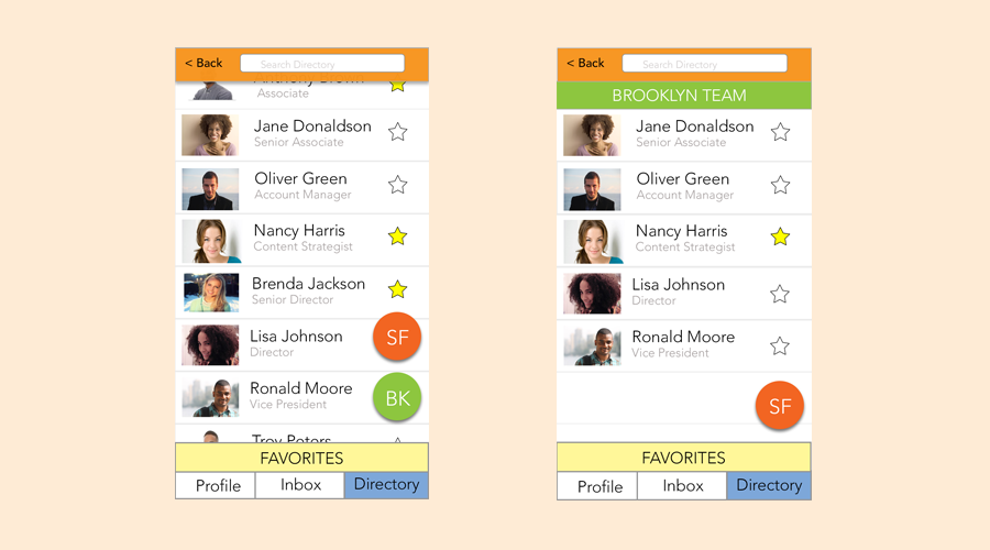
I designed recommendations for a new employee profile interface, an interactive directory and a new-user onboarding experience.


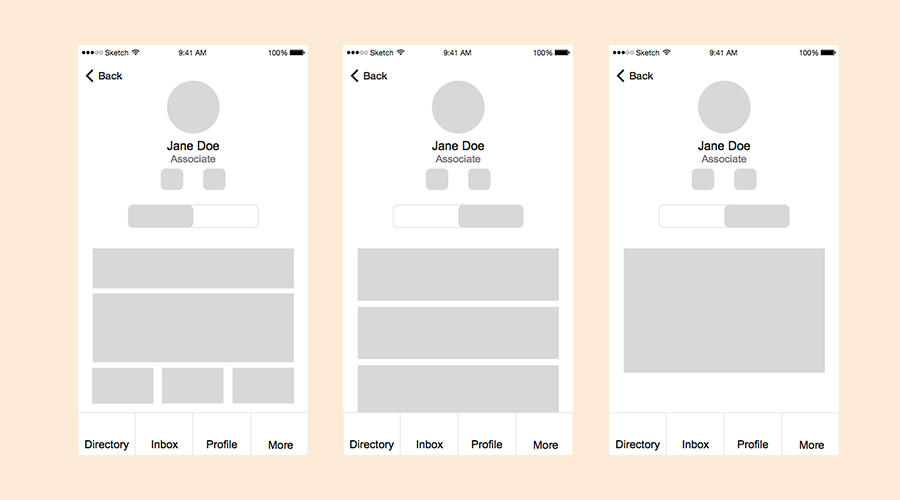

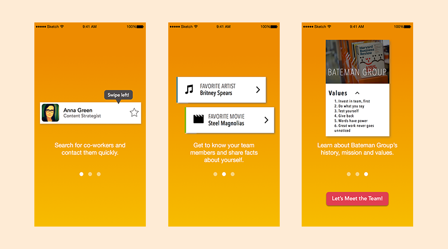
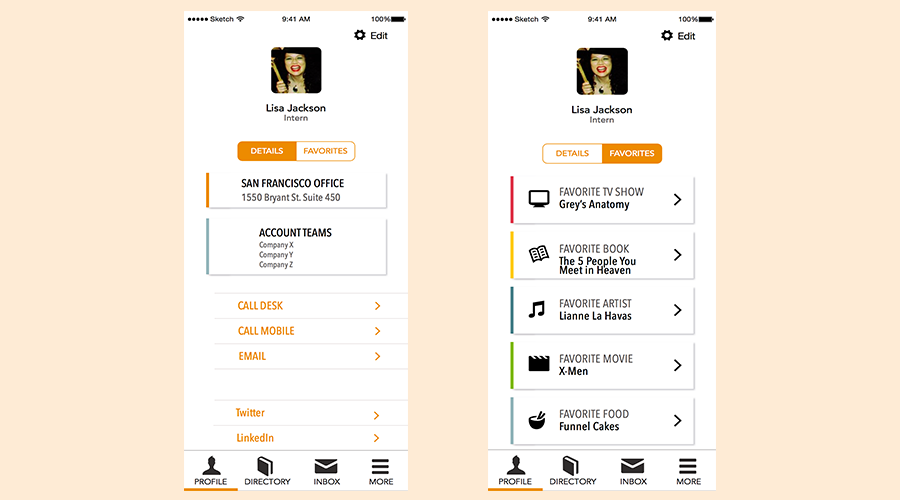

Hi-fidelity prototype of the onboarding, profile and directory interfaces
The last step of my process is always a quick debrief. During this time I reflect on what worked, what didn't and how I can make my workflow more efficient.
While it's unfortunate that the project never made it to development, I enjoyed working with the software development team. In the future, I'd get them more involved with the actual design and research processes.
I'd also do a better job of understanding the constraints before I started the work. This time around I paid a lot more attention to business goals and user goals and didn't consider technological constraints as heavily as I should have.
One of the most interesting parts of my design process is going back and reviewing all of the ideas that didn't make it into the final prototype.
A couple of those ideas include:
Design processes have to be flexible. While it would be nice to move fluidly from step 1 to step 2 and so on, new constraints can easily throw you off course. The test is in being resilient and keeping your pace instead of being slowed down.